04.03.24
Learning, teaching and giving – oh my!
Like most of us, I spend my days on multiple devices, making calls and taking meetings, leaving little room for the basics like eating, breathing fresh air or giving back to the community that surrounds me. Taking a step back, I compiled a list of all the community and educational activities MK3 has been participating in over the past few years, and I was struck by our growth: from 4 events in 2022 to over 13 last year!
2023 found us on the production team for the Embrace Boston unveiling, enjoying a few music history lessons from Dr. Emmitt Price at Berklee School of Music, welcoming guest speakers on topics like antisemitism, Hispanic heritage, people with disabilities and improving diversity in the workplace. We volunteered our time on Thompson Island, taught presentation and sales skills at Junior Achievement organization and hosted students from the Fresh Films educational program to learn more about what we do at MK3.
How did we do it? First we made a plan, then we made it a priority and involved everyone on our team. Basically, you have to make a commitment to breathe a little fresh air. And it’s not about “fun time” out of the office, it’s about bringing your team together and opening up everyone’s perspective – exercising and strengthening your values and learning about yourself and others.
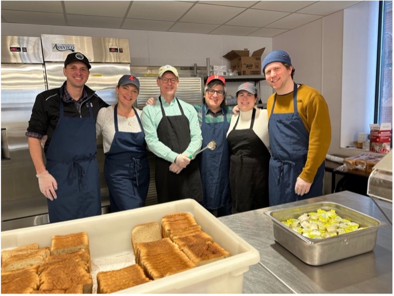
Our goal for 2024? Transition from education and learning to action and participation. To put it simply: show up and help. And we’re already off to a great start by serving lunch at the New England Center and Home for Veterans and planning events for Black History Month. There’s always more we can do, and we’re building out a 2024 plan with the hope that it brings us all closer together. Now if I can just get outside…
Life lessons by Alexandria Hunter-Whalen
Like most of us, I spend my days on multiple devices, making calls and taking meetings, leaving little room for the basics like eating, breathing fresh air or giving back to the community that surrounds me. Taking a step back, I compiled a list of all the community and educational activities MK3 has been participating in over the past few years, and I was struck by our growth: from 4 events in 2022 to over 13 last year!
2023 found us on the production team for the Embrace Boston unveiling, enjoying a few music history lessons from Dr. Emmitt Price at Berklee School of Music, welcoming guest speakers on topics like antisemitism, Hispanic heritage, people with disabilities and improving diversity in the workplace. We volunteered our time on Thompson Island, taught presentation and sales skills at Junior Achievement organization and hosted students from the Fresh Films educational program to learn more about what we do at MK3.
How did we do it? First we made a plan, then we made it a priority and involved everyone on our team. Basically, you have to make a commitment to breathe a little fresh air. And it’s not about “fun time” out of the office, it’s about bringing your team together and opening up everyone’s perspective – exercising and strengthening your values and learning about yourself and others.
Our goal for 2024? Transition from education and learning to action and participation. To put it simply: show up and help. And we’re already off to a great start by serving lunch at the New England Center and Home for Veterans and planning events for Black History Month. There’s always more we can do, and we’re building out a 2024 plan with the hope that it brings us all closer together. Now if I can just get outside…
Life lessons by Alexandria Hunter-Whalen